Logo Booklet
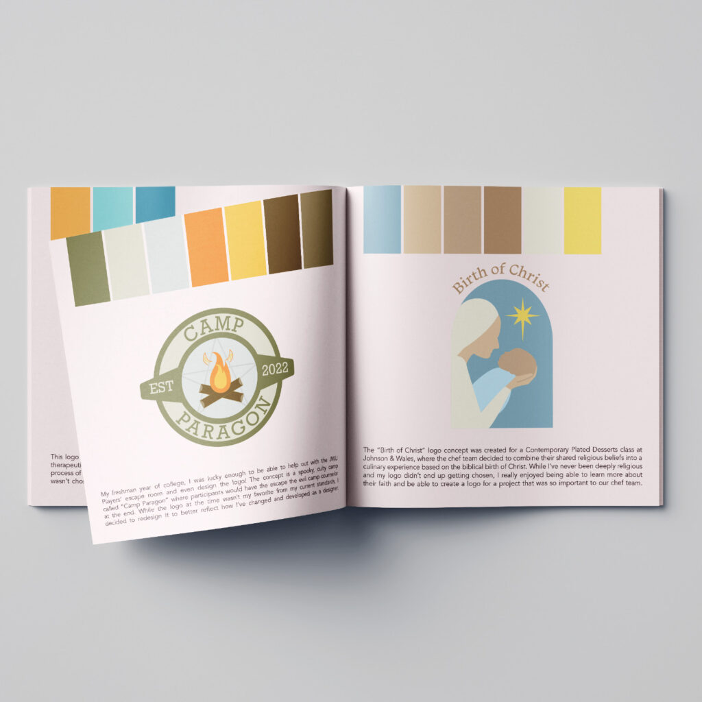
Logo Booklet Personal/Educational – Logo Design & Brand Identity Design In my time as a designer, I’ve had many brand concepts that I loved that, as of now, haven’t come to fruition. It always bums me out to see fun concepts go to waste, so I wanted to showcase them in a quick, comprehensive way. From that, I chose ten of my favorite unused or in-process of being used logos and designed a logo booklet with a short explanation of what the logo is and why I created it. The logos showcased are Eclectic Abodes (maximalist decor), Team Boston (Levy Convention Centers in Boston), Brews & Boos Spirit House (horror-themed pub), Willow’s Wellness (earthy women’s self-care brand), Golden Cove Hospital (unused therapeutic cuisine logo), Diva Dice RPG Accessories (feminine + queer-inclusive tabletop RPG supplies), Camp Paragon (spooky summer-camp-themed escape room), Birth of Christ (my concept for the Birth of Christ project), Into the Garden (my concept for the Into the Garden project), and The Three Marketeers (Spring 2026 Design Team branding). It was a lot of fun getting to revisit these old ideas and write about them! Click here to view the full logo booklet!
Chaos Media
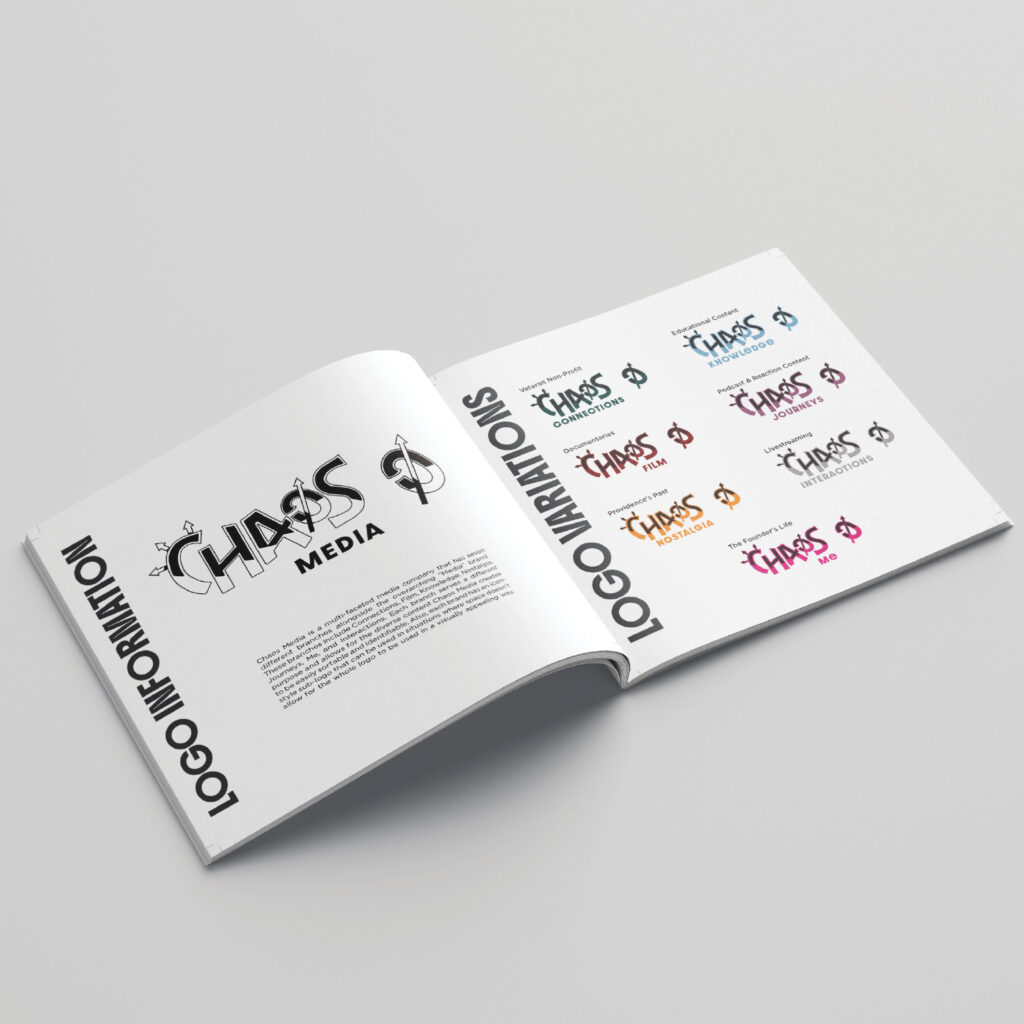
Chaos Media Client – Brand Identity & Logo Design I worked with two fellow design students to develop the branding for an entrepreneurship student, Kelly’s, media organization, Chaos Media. Chaos Media is an edgy, multifaceted company that reflects her personal vibe of organized chaos. The brand has seven branches: Film, Nostalgia, Journeys, Interactions, Me, Knowledge, and Connections, the last being a nonprofit supporting veterans and reflecting Kelly’s own experience as a veteran. I designed the main logo along with all its variations and created a comprehensive brand guide detailing proper logo usage, colors, typography, and imagery. My teammates developed social media templates that Kelly can adapt for posts. The brand aims to disrupt traditional perceptions of both media companies and veteran nonprofits, combining a bold, unconventional aesthetic with a clear structure. It was a pleasure working with Kelly, and I’m so happy to have gotten to make her dream a reality! Click here to view the Chaos Media brand guide!
Ari’s Starry Delights – Senior Buffet
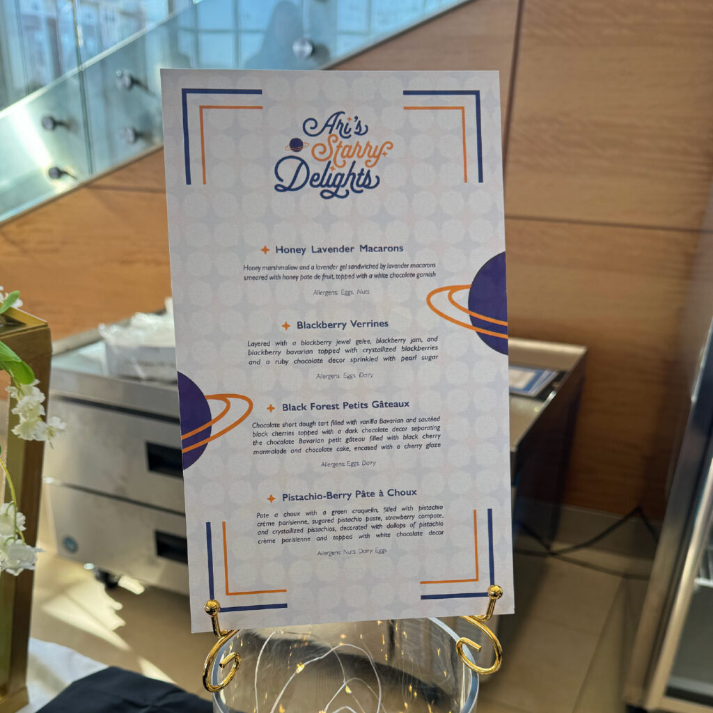
Ari’s Starry Delights (Senior Buffet) Client – Brand Identity, Typography, & Layout I collaborated with baking and pastry senior Chef Ariana to develop a space-themed brand identity for her senior capstone buffet presentation, using a purple and gold color palette. We created a cohesive look that included four item cards and a menu featuring those items, using the playful font Selfie to add personality. To tie the theme together, I incorporated Saturn visuals and four-point star graphics throughout the designs, giving the presentation a whimsical cosmic feel. With a tight three-week turnaround, we worked to ensure the branding was consistent across all materials while highlighting Chef Ariana’s creations in a fun and visually engaging way.
Blackwater Bog Soda
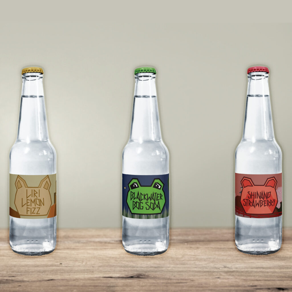
Blackwater Bog Soda Educational – Logo Design & Packaging In my junior year packaging design class, I created a soda brand called Blackwater Bog Soda, inspired by the Blackwater River in Ireland and featuring a frog mascot to fit its swampy vibe. The logo was hand-drawn through sketches and refined using the pen tool, giving it a playful, personal touch. After developing the original concept, I expanded the brand by creating additional flavors, including Shinano Strawberry, inspired by the Shinano River in Japan with a tanuki mascot, and Liri Lemon, inspired by the Liri River in Italy with a wolf mascot. I particularly enjoyed designing the mascots in a geometric style, which reminded me of a simplified form of pixel art. The project allowed me to explore creative packaging design, and I hope to continue adding more flavors in the future.
Birth of Christ
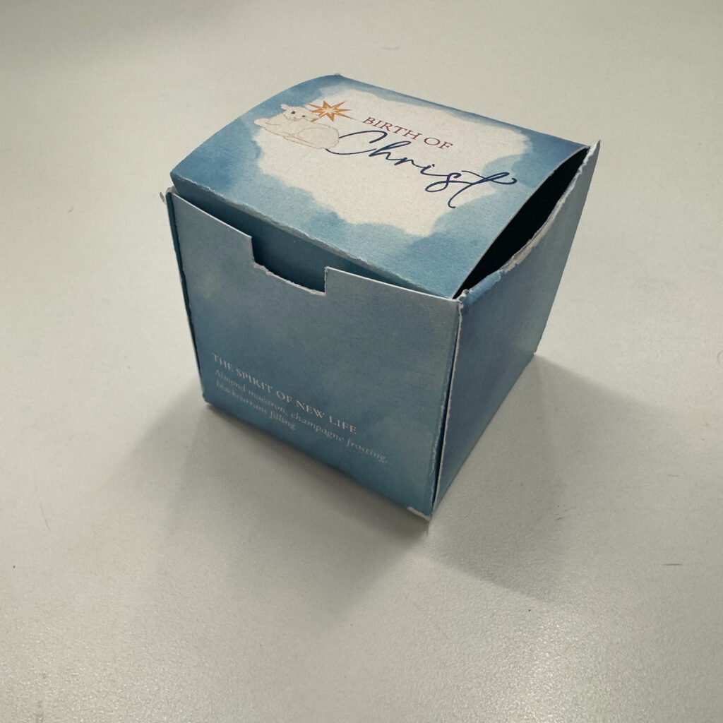
Birth of Christ Client – Packaging, Production, & Brand Identity Whenever I tell someone I attend Johnson & Wales University, they assume I’m studying culinary arts, which makes sense given the school’s reputation. I’m not a chef, but I do collaborate with those who are. One of my most rewarding projects came in October 2025, when my design team partnered with four chefs in the Contemporary Plated Desserts course to create branding, menus, comment cards, and take-home packaging for their chef’s table in just two weeks. Their theme, the Birth of Christ, required visuals that were reverent rather than holiday-themed, so I researched the religious context to ensure our designs were thoughtful and accurate. We developed concepts, refined logos, and landed on a lamb-based design that captured their vision. I designed the pastry box, which was simple and elegant despite printer and cardstock challenges. In the end, we delivered cohesive menus mounted on etched wooden boards and finished packaging. Seeing the chefs’ excitement made the stress worthwhile and showed me how design can elevate someone else’s craft and story.
South County Hospital Internship
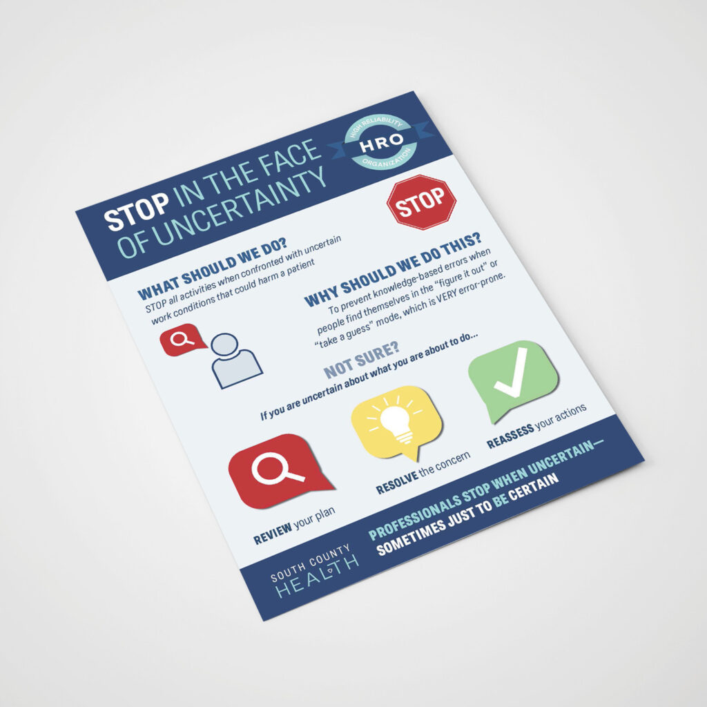
South County Hospital Internship Internship – Marketing, Layout, Informational When it came time to find an internship for my graduation requirements, I never thought that the best opportunity I’d find as a very non-minimal designer would be through a hospital. However, I was very wrong. As the design-focused Marketing Intern at South County Hospital in Wakefield, RI, I’ve gotten the opportunity to design event fliers, HR notices, digital graphics, invitations, staff appreciation materials, clinical forms, brochures, and even menus. I had the chance to apply a strong, existing brand identity through the listed mediums while still being able to show my own creativity and ideas at the same time. Working with South County Hospital’s marketing team was such an informative and positive experience that has absolutely shaped my design skill range and interest in careers moving forward!
Dungeons & Dragons Cards
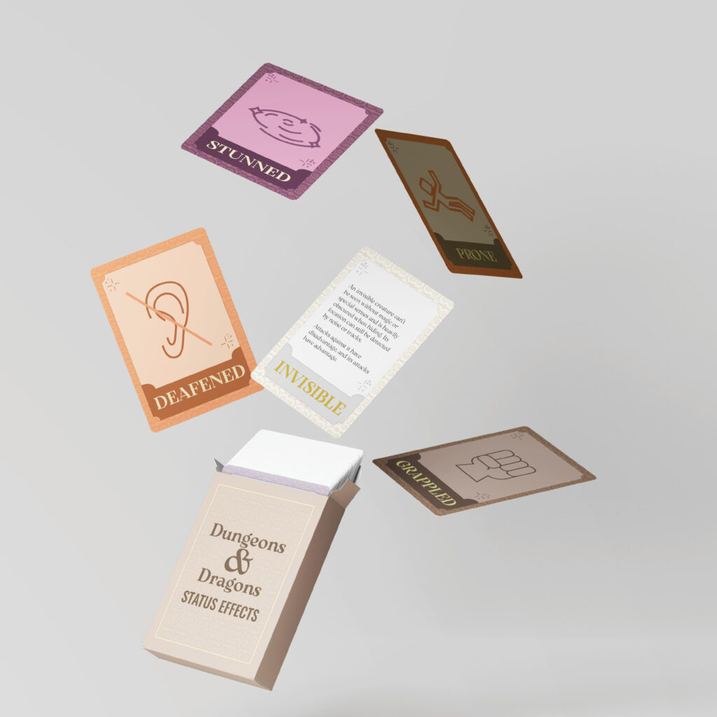
Dungeons & Dragons Status Effect Cards Personal – Illustration, Layout, Packaging Dungeons & Dragons has become one of my favorite hobbies over the past few years, so I combined that passion with my love for design by creating cards that explain in-game status effects like being poisoned, blinded, or unconscious. Each card featured distinct colors and symbols to match its effect, like romantic pink shades for “charmed”, while keeping a consistent layout with descriptive text and clear yet interesting graphics. Using the versatile font, Arsenica Variable, in several weights such as demibold for titles and regular for descriptions, balanced readability and style on the small cards. Designed for both practicality and flair, the simple icons and colors made effects easy to recognize at a glance. In this project, I strived to communicate that design can be fun, practical, and visually appealing simultaneously.
Wedding Favors
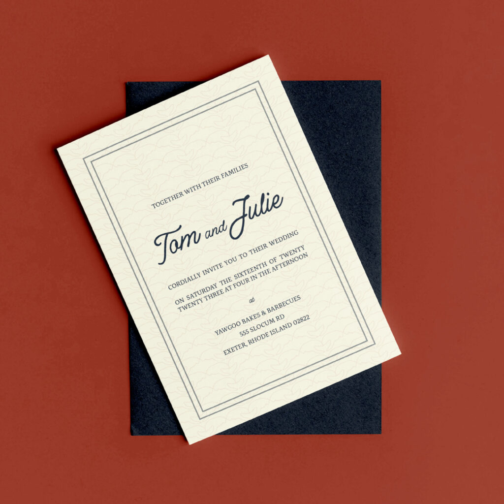
Wedding Favors Client – Layout & Illustration When my dad and Julie met, it was love at first sight. I aimed to evoke the same emotions with the custom design of their wedding labels for gummy lobster jars. Held at a casual, rustic clambake venue, the project allowed for creative expression in a chill yet elegant way. Our whole family loves Disney and has centered a lot of our aesthetic around it, so the “Happily Ever After” theme emerged. When I decided to sentimentally revisit the event, I was filled with inspiration that led to expanding on and modifying the design. With that, I created wedding invitations inspired by oceanic motifs and a touch of Disney magic to go with the initial wor
Into the Garden
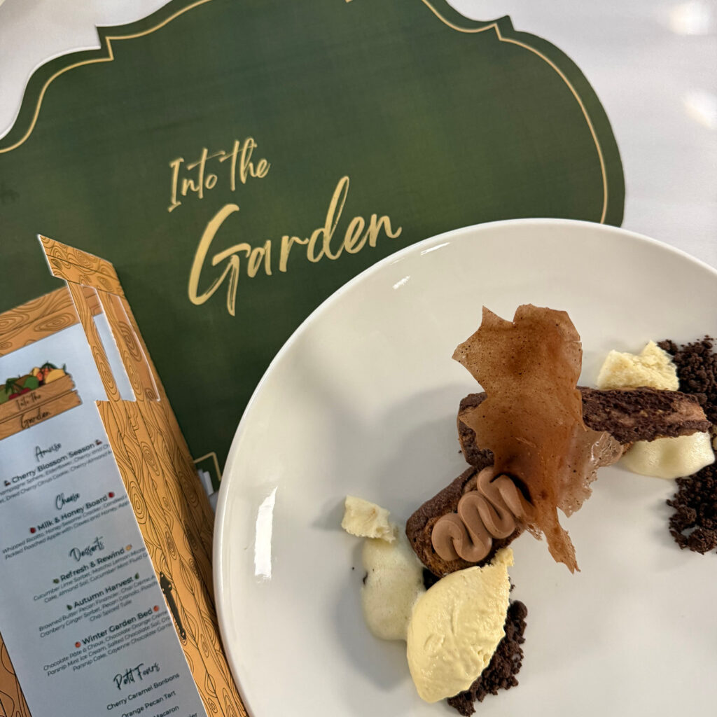
Into the Garden Client – Packaging, Production, & Brand Identity In the spring semester of my senior year, I worked again with the Contemporary Plated Desserts class on a project themed “Into the Garden,” exploring seasonal fruit flavors. The brand combined colorful fruit illustrations with a rustic, homegrown feel. I merged my illustrated fruit logo concept with my teammate Colton’s crate idea, before creating a garden-door inspired menu with different fruit symbols to represent which seasonal flavors are in which dish. My teammates designed the rest of the deliverables, where Colton designed a clean, elegant placemat and comment card, and Kayla created a 3D-printed stump-inspired takeaway package and seed paper napkin holder. Despite the quick turnaround of just two weeks from initial meeting to final deliverables, our team delivered a cohesive, season-spanning design in collaboration with the chefs.
“Herstory” Music Festival
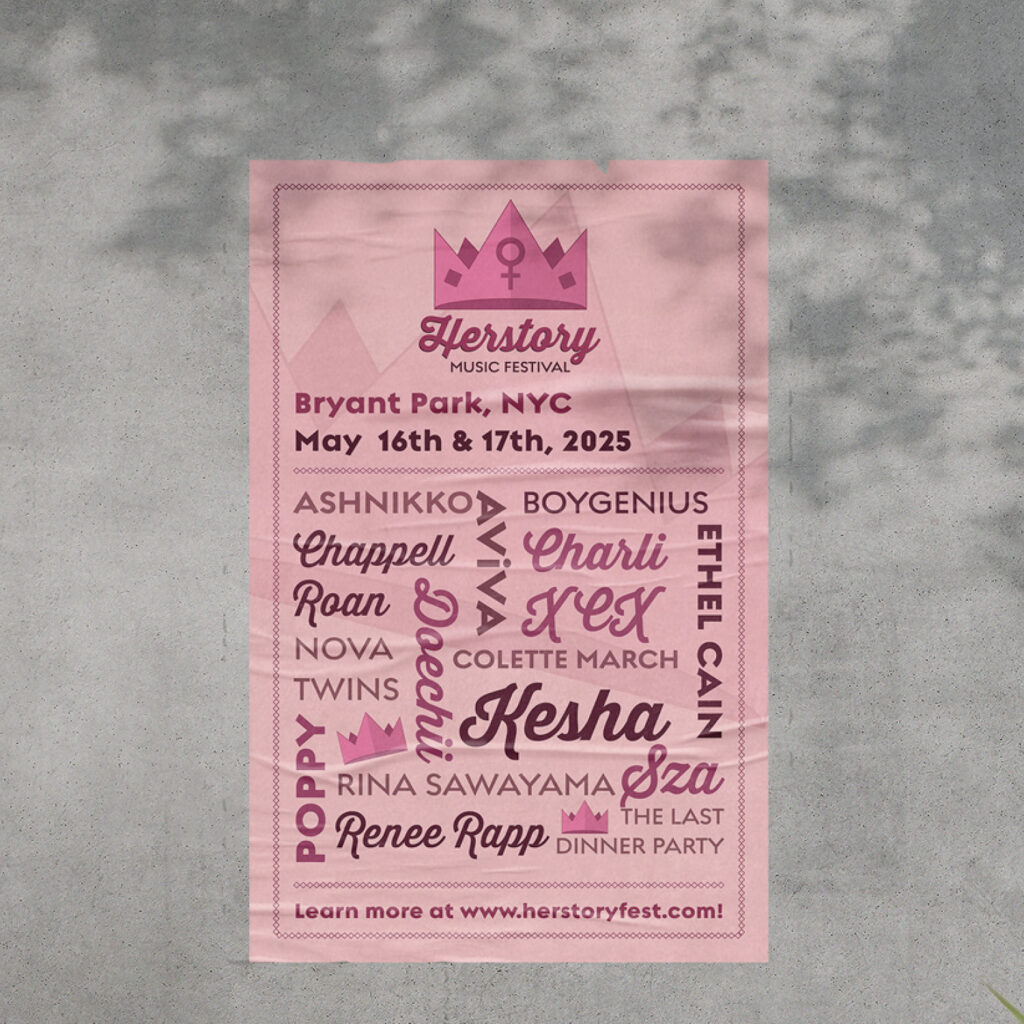
“Herstory” Music Festival Personal – Illustration, Layout, & Brand Identity This project started as a high school assignment and eventually turned into a full idea for a music festival in Bryant Park celebrating amazing female artists who’ve helped shape feminist conversations in music. Inspired by the performers who influenced me growing up, I imagined promotional materials, merch, and social media marketing aimed at a college-age audience to reflect how festivals realistically reach listeners and build hype today. After figuring out the event itself, I revisited the original design and changed it from a neon green background to an all-pink aesthetic, intentionally reclaiming femininity as something powerful, confident, and worth embracing. In the end, the project became a personal reminder that design can be a voice, and mine will always support women owning their stories, creativity, and space in the world.