Strawberry Menstrual Products
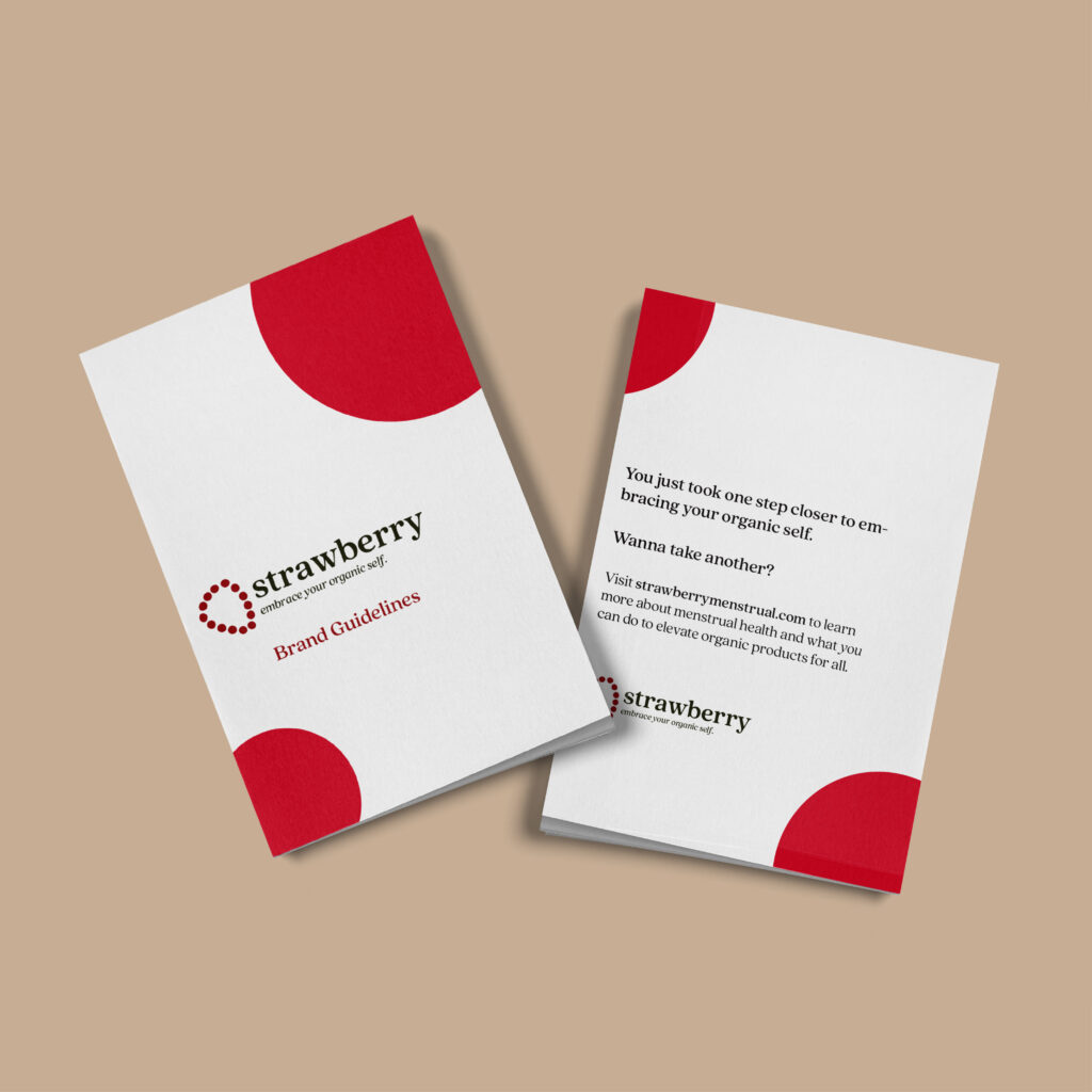
“Strawberry” Menstrual Products Educational – Brand Identity, Layout, & Package Design – Fall 2024 In my sophomore year of college, I created “Strawberry,” a fictional menstrual product brand that encourages people to embrace their organic selves and rethink how we talk about periods as a society. “Strawberry” seeks to destigmatize periods, and reject the typical clinical aesthetics surrounding the topic. This brand replaces those typical vibes with humor and honesty. In the design process for this brand, I wanted the identity to contain playful visuals, such as red dots. These red dots are meant to represent what a lot of women, including myself, would use to discreetly mark down the start of their period on a calendar. I took these dots and not only made them a brand attribute, but also an instrumental part of the logo, forming a strawberry. Speaking of, the name “Strawberry” comes from researching some slang terms for a period, one of them being “strawberry” or “strawberry fields.” I also took some other slang terms, such as “Shark Week” and “Red Tide,” as shade names for the several shades of red in the branding. Then, using a fruit as my brand name was also helpful with part of my mission, as I sought to have the products’ organic ingredients be a focal point of the brand. This was partly because I created “Strawberry” in the height of some controversy over harmful chemicals being used in menstrual products, which made me feel nervous about products found on the shelves today. The last, yet one of the most instrumental parts of this project was to create a menstrual brand that wasn’t overly feminine. As someone with several friends who fall under the transgender umbrella and experience menstrual cycles despite not identifying as a woman, I found it very important to create a menstrual care experience for everyone. While this brand isn’t a real product to be sold on shelves, I can only dream that more menstrual brands adopt a more gender-neutral aesthetic in the future. In the end, “Strawberry” aims to destigmatize periods for EVERYONE, regardless of gender identity, as well as provide a safe, organic product so that those already dealing with the woes of a period don’t have to worry about nasty chemicals in the very product they use to relieve it. Click here to view the “Strawberry” brand guide!
Crash! Alternative Fashion
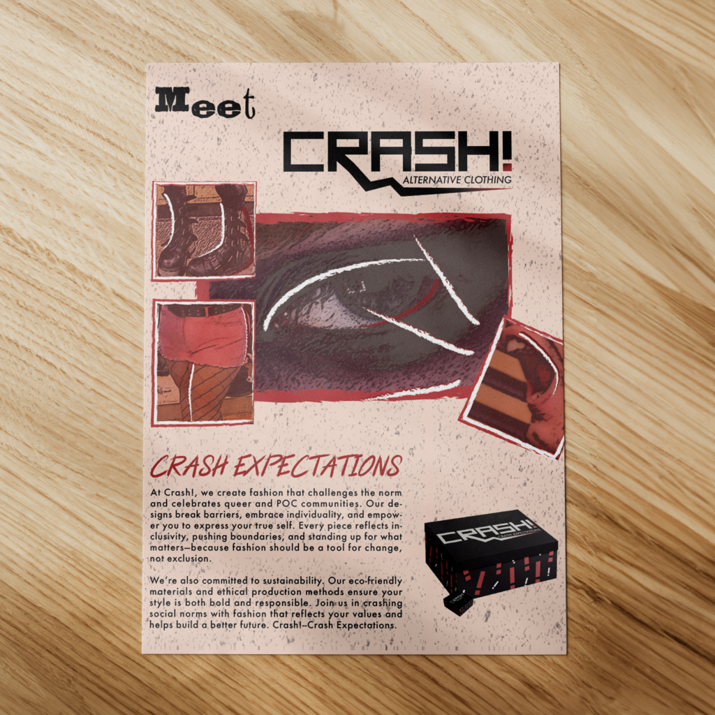
“Crash!” Alternative Fashion Educational – Brand Identity, Layout, & Packaging In the spring of my junior year of the Johnson & Wales Graphic Design program my professor tasked us with creating or expanding on a brand we had already made, but instead of creating a brand guide, we created a multimedia ad campaign. This was a very exciting concept to me, as there was a brand I had conceptualized in the Fall but never expanded on. That brand was “Crash!”, an alternative/punk fashion brand that took the “brand” out of brand design. Now I know what you’re thinking, “Isn’t being punk all about avoiding consumerism because of how unethical it can be?” You’re completely correct! But what if we made a brand that allows people to enter the punk scene in a way that avoids all of the unethical corporate practices? In a world where this brand is real, the clothing products would be completely ethically and organically produced in ways that produce the least waste possible. With that, a portion of all proceeds would go to charities that benefit marginalized groups, such as POC and LGBTQIA+ organizations. From that, I sought to create a tagline that’s flexible but still communicates the same ideas. That’s where “Crash Expectations” came along. This tagline encourages individuality and being unapologetic, which also birthed the ad campaign I was tasked with creating. I wanted the overarching theme to be “Crash _______,” so that I could create ads that explain the brand’s values in just one word each. Some examples of phrases I ended up using are “Crash the Patriarchy” and “Crash Intolerance.” While all of my ideas felt great, I really needed to shift my focus to the actual designs as well. The initial logo I made for a “ten logos” challenge the semester before was a hand-written, intentionally messy, but kind of clunky (in a bad way) logo. I wanted to update it so that it still had its same customized edge, but was more streamlined and less overbearing. That’s where I created a “typeface” with the shapebuilder in Illustrator and had it in an off-black shade, but faded into a fun lightning bolt to maintain its aforementioned edge. While I loved my original logo, this was definitely a much more professional interpretation of my brand vision. Next, it was time to create my ads! I had to create a myriad of different formats, such as multiple billboards, a poster, and a few different magazine ads. I wanted to create a “cut and paste” scrapbook feeling in my ads that communicated the organized chaos that this brand represents. I decided to find some images of myself and some friends in the edgiest clothing I could get to implement into the ads to add a personal edge. After using some Illustrator filters and creating a drawn-on border to make it look like ripped paper with red accents, I was able to adapt a lot of my images to the ads. Even though it was an unconventional way of doing things, it worked out! As part of the project, I created a few pieces of packaging material for the brand. I designed a shopping bag, a shoebox, and a jewelry box. I kept it consistent with the branding by having it in off-black boxes with the titular exclamation point on the sides in red and white. It followed the branding, but in a different enough way to create some variety and differentiate it from the promotional materials. At the end of the day, this project really created a brand I wish existed in the real world. Hopefully, someday I can see that this comes to fruition in some shape or form. But for now, I’m happy to just put the idea out into the world and let everyone Crash Expectations.