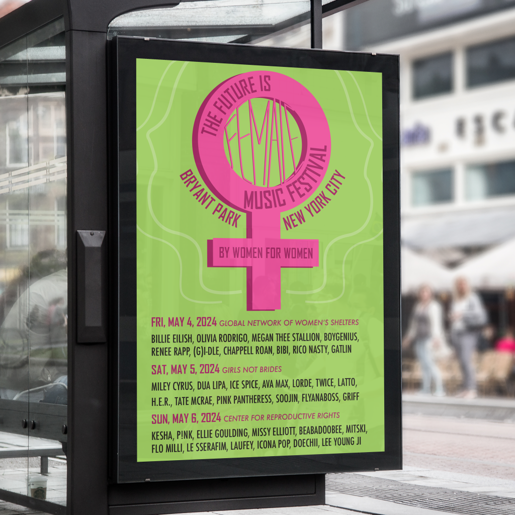
"The Future is Female" Music Festival
VECTOR / LAYOUT / PRINT / BRANDING
Social Justice Designer
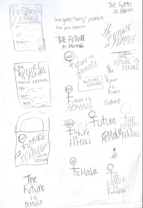
It’s no secret to those around me that I’m a feminist. I’m pretty outspoken about my beliefs on women’s rights and positive female representation in media. Of course, for many designers, their humanitarian beliefs tend to bleed into their personal projects, as it did for me. That takes us to my senior year of high school computer graphics class. When being taught how to use the 3D tools on InDesign, we were told to create something with it. At the time, I decided to make an unfinished at best vector with a lime green background with lighter wavy patterns, a hot pink female symbol, and the text “the future is female” above it. Though the concept was definitely there, it wasn’t my best work. However, when choosing what projects to include in the portfolio and told we can build upon old projects from before college, it was a no-brainer.
Music with Meaning
Music has been a very important part of my life, as it is for many others. Specifically, female artists that aren’t afraid to push the envelope of equality helped me get my start with feminism at a young age, namely Ke$ha and Britney Spears. Nowadays, artists like Chappell Roan and Renee Rapp do the same with the added factor of queer representation. With the term, “the future is female,” I wanted to pay homage to female artists that have paved the way in the industry as well as wanting to do humanitarian work with “The Future is Female” festival, that includes ten or more female artists each day in a three day period that has the proceeds of each day go to a different charity that benefits women around the world. These charities would be the Global Center of Women’s Shelters, Girls Not Brides, and the Center for Reproductive Rights.
A Non-Event Management Major Planning a Music Festival
Female artists that have maintained feminist messages and empowerment were selected from many areas of the music world, from hip-hop to alternative to k-pop. Sure, I picked from some of my favorite female artists, especially on the friday lineup, but also picked from some of my friends’ favorites and other popular artists in general. For the location, several other music festivals were researched to find a good outdoor venue that would make sense for a hypothetical event like this. That’s where Bryant Park in New York City came in, as it’s also the location for the Governor’s Ball, a very popular and successful music festival that tends to have many high-profile artists performing.
Pretty Promotions
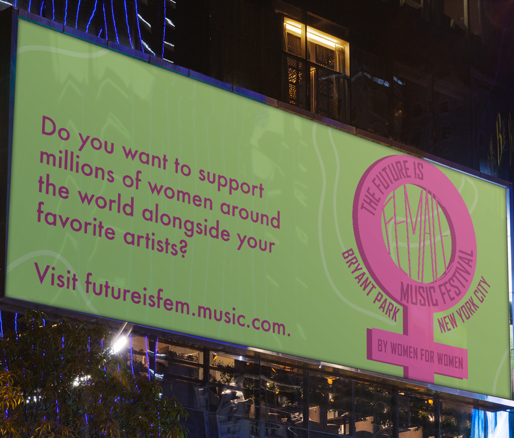
Following the green and pink color scheme of the initial project from high school, the background of the content was a lime green shade with several softer green shades for different wavy lines. When a friend looked at it as a second pair of eyes, the idea of having facial side-profile-type lines around the female symbol was an interesting element to add to highlight the humanity of the situation as well as a creative way to incorporate the wavy lines. The focal points were all in pink or black, which was the logo and the typography. As pretty as the background is, the most important part should be the words.
Creating a Brand
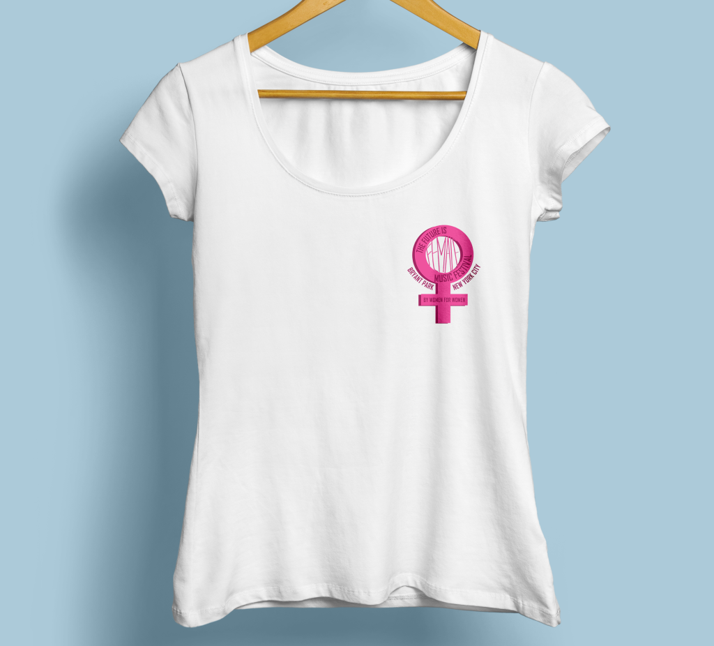
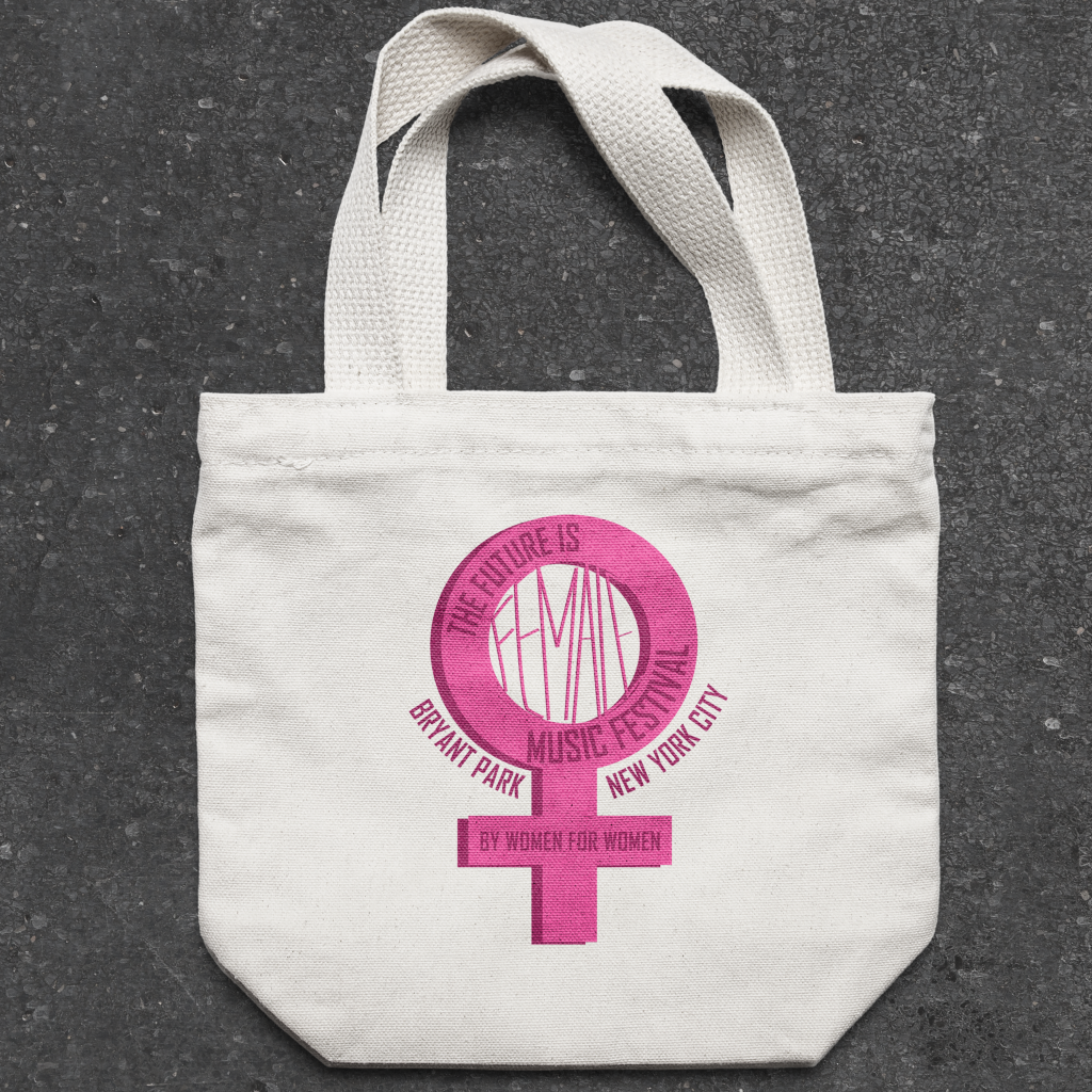
To finish off this project, the initial promotion poster was expanded into merchandise and a billboard that would further advertise the event. An event like this would likely gain a lot of traction, especially with the celebrity guests, but still may need to have the charity aspect highlighted, as it is the main purpose of the event. The prospect of building a hypothetical music festival from the ground up is jarring, especially with considering the gravity of the fundraising being done. However, having a good eye for design and the media makes it all just a bit easier.