Dungeons and Dragons Cards
VECTOR / LAYOUT / TYPOGRAPHY
The Need to be Nerdy
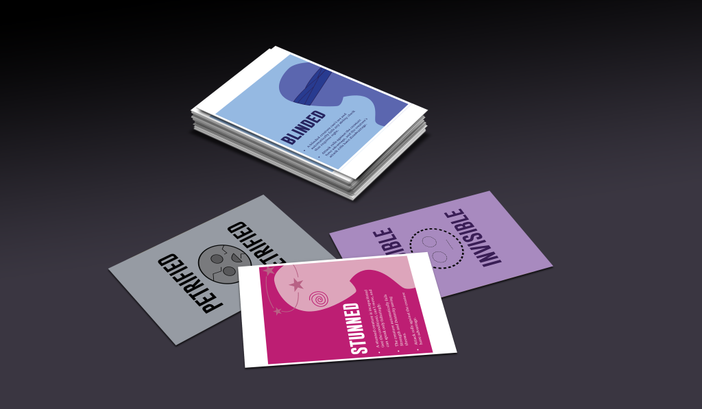
Dungeons and Dragons has been one of my favorite hobbies over the past few years. Last summer, for the group I was playing with, I created cards to help explain the several status effects that can be put on characters in the game that may cause changes in gameplay. Some of these are being poisoned, incapacitated, blinded, or unconscious. Although designing outside of one’s comfort zone is ideal and helps with creativity, one may be able to find inspiration and interest in a topic that they’re knowledgable and passionate about.
Colors and Typefaces and Symbols, Oh My!
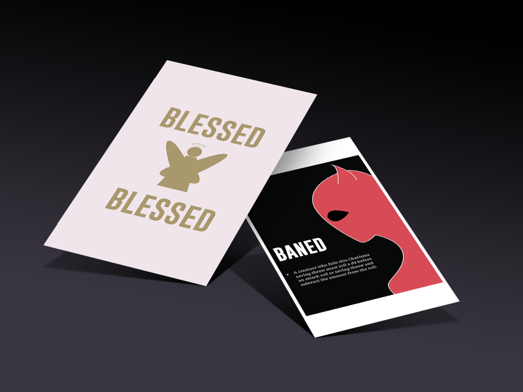
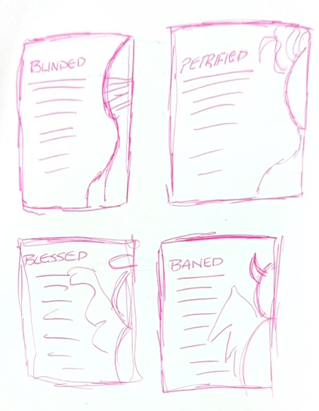
Unique colors and symbols were prevalent in design choices made to reflect the unique effects. For example, blessed is cream and gold, as it reflects typical holy symbolism while still reflecting a stark white. However, some facets, such as general layout and typography, remained the same. The base of it, of course, is uniform, as it has one side with the description and a side-profile graphic, and one with basic type saying the name of the effect paired with a basic symbol representing it. The font, ‘Gobold,’ fits for the header text as it’s a simple sans serif that also is incredibly bold and heavy weight. The 12pt ‘Monarcha’ font pairs well for body type as it’s a serif as compared to the sans serif header and is readable despite the size. Although it is a 12pt font, it’s printed on a business-card-size card, which makes size differences even more drastic.
Practical Play
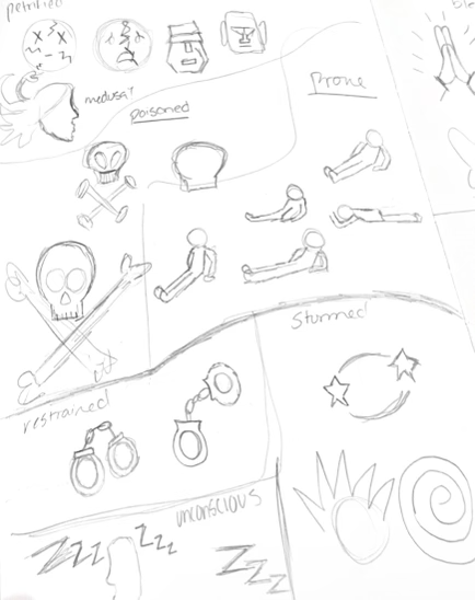
Albeit pretty, these cards are meant to be used in a real game too. Although those that would use them are my friends, I had to consider basic user experience and product design. The simplicity in the symbols paired with different colors for each card allows for easy distinction between cards without even having to read the title. Also, the side-profile reflects what the effect is although it’s right next to the description, i.e. having a blindfolded person on the blinded card, which further makes viewing easier and faster.
Fear of being Boring
My design style is born of bold colors and typefaces, which was clearly represented in this project. Many other informational cards, whether it be an item or effect, in the TTRPG (tabletop roleplaying game) world tends to be bland despite the osthentatious nature of the game. Let’s normalize being whimsical and informational at the same time! Why do they have to be mutually exclusive? Using my extensive knowledge of Dungeons and Dragons with design helped combine one of my most random, yet kind of useful skills with the one I’m most proud of, respectively.
The Final Product
